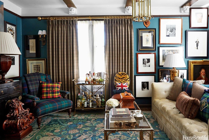
The Rooms Of Scot Meacham Wood
Our last post celebrated the carefree life of the bachelor. It also noted how, at least in the movies, bachelors eventually crystallize into husbands.
The rooms of San Francsico-based designer Scot Meacham Wood (a veteran of Ralph Lauren, you can probably tell) look like places that could be enjoyed by a female cohabitant.


It looks very much like Polo Ralph Lauren, except for the Purple Label room.
Seriously, though, as nice as all the things are, I think there are just too many of them. Although everything is organized and in its place, it looks cluttered. There is a happy medium between the riot of objects seen in these photos and minimalism.
Henry – I absolutely agree. It makes a pretty picture, and most of the pieces are lovely, but I have enough of a clutter problem trying to keep books, magazines, DVDs, CDs, glassware, bar supplies, pillows, fireplace tools, clothing, etc., etc. stowed and organized. If I started out with every surface already covered with beaux objets, I would be engulfed. To be honest, I fear my walls, tables, shelves, bookcases, and so on are already approaching maximum capacity. I know my poor wife sometimes longs for a more Japanese esthetic, but I fear “Overstuffed Farmhouse” is the look we are stuck with.
I would respectfully disagree. There’s no doubt that this is also something of an English or East Coast feel, I think the rooms provide a coziness, as well as visual interest, because they feel very personal. I think the many pieces of wall art and photos in particular invite the eye and conversation of discovery.
I love the warmth of each room.
I am with Amy. While the rooms may appear overly affected by clutter, these objects hold deeper meaning: a rarefied artifact passed down, Gram’s old ginger jars, Da’s favorite coffee table book on old aircraft, or kitschy trinkets from abroad. While mid-century mod designers scoff at these misunderstood “affectations,” those of us who treasure the memories these objects conjure understand their necessity and we are not concerned with what the Swede/Dane/German/Japanese preference has captured the hoi polloi’s attention . While the winds of IKEA may howl, we’ll simply batten down the hatches. I’m sure Fussell would have interesting observations concerning these photos.
I agree that it’s a different esthetic (ooh! There’s Christian’s favorite word!) than the minimalist clean lines of Scandinavian/Japanese design (which I am not championing), and I freely admit that these rooms are all well put together and look very nice. If the majority of the objects had personal meaning, then yes, it’s nice to have them out to enjoy, but I get the feeling that the rooms are mainly put together with Very Expensive Things. I would find it hard to relax in such an environment.
Although I do dream of some day having a study with floor-to-ceiling bookcases, overstuffed chairs, a fireplace with tools, a bar, and other traditional English/gentlemen’s clubroom touches, I would not like it to be as overflowing with Things and Stuff and Important Objects as these rooms are.
Personal preference, that’s all.
Glad to see this post! 😉
Thanks for the tip, Makaga.